What do Isaac Newton, Ronald Wayne, and Steve Jobs have in common? They were all involved in developing Apple's first logo, which wasn't even an apple.
While the first logo never made it far, today's iconic Apple logo is the most recognizable logo design in the world.
And, it's a minimal design.

No longer multi-color and striped, the single-color apple is a simple illustration that conveys everything someone needs to know about the product.
A minimalist design style consists of simple shapes and forms and a limited number of color palettes and materials. This simple design approach can often be just as eye-catching and effective as a complicated design, sometimes even more so.
People once thought this concept was reserved for famous artists and found only in elite art galleries worldwide. Today, it's present in thousands of marketing campaigns from Mastercard to Tiffany and Theory, transcending industry and social class.
The classic adage that less is more still rings true for brands today. Design doesn't have to be difficult to be well-executed, memorable, and effective.
Minimalistic designs are everywhere - on the web, printed marketing materials like custom posters and catalogs, and in smaller designs like business cards and stationery as well as other marketing collateral. So, when creating a poster using a poster maker, make sure to use minimalistic designs.
So whether you're a content creator or a graphic designer, this article will introduce what simple design is, why you should use it, and how you can employ it in your marketing strategy.
 Markup Hero - Blog
Plus, we'll take a look at four brands using minimal design in their marketing campaigns to find inspiration for your next project.
What Is Simple Design?
The history of minimalism dates back to the beginning of the post-World War II, now taking the form of an art movement. It became more prevalent in American visual arts in the 1960s and early 1970s and has continued to gain popularity in the design world.

The idea of "less is more" permeates every part of minimalistic design. It amplifies the simple, basic design elements and is all about simplicity, utility, and elegance.
On the other hand, most people characterize maximalism in terms of an aesthetic of excess. If minimalism is "less is more," then maximalism is "more is more."
Neither design style is right or wrong, but rather each is representative of the brand's identity, voice, and deeper core values and message.
Businesses that prioritize using simple designs over more complicated ones understand that the user experience is an essential part of any design project.
If a user is turned off by the visual elements, confused about the typography, or overwhelmed with overcrowded text and images, they are less likely to be persuaded by the copywriting and take any desired action.
When materials are easier to read and digest and unique and memorable, potential customers or clients are set at ease and more open to exploring what the company has to offer. They are also less likely to make quick judgments about the business' product quality.
Minimalistic designs are present in every form of medium. However, they have become increasingly relevant for billboards, posters, and business cards.
These forms of print media require careful design planning around typography and imagery. In addition, they must quickly convey a compelling message and call to action in a way that's easy to understand.
Minimalism vs. Simple and Fast
Just because minimal design is well, minimal, that doesn't mean it's fast and easy to create. Creating effective minimal design and incorporating it into your marketing is an art as much as a skill. But sometimes the job calls for quick and easy designs.
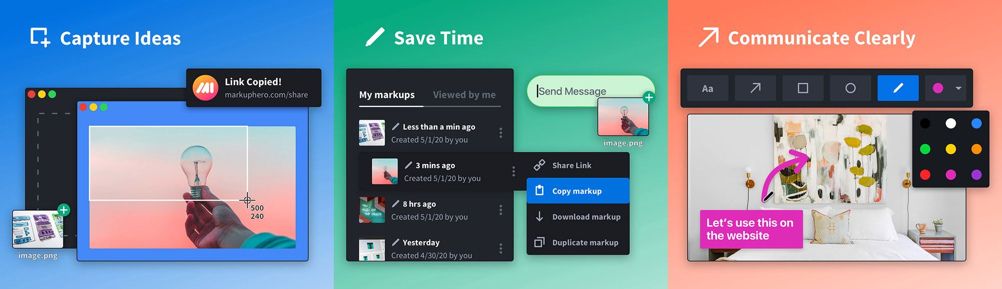
Enter Markup Hero, the easy to use markup tool for creating quick and effective marketing design assets.
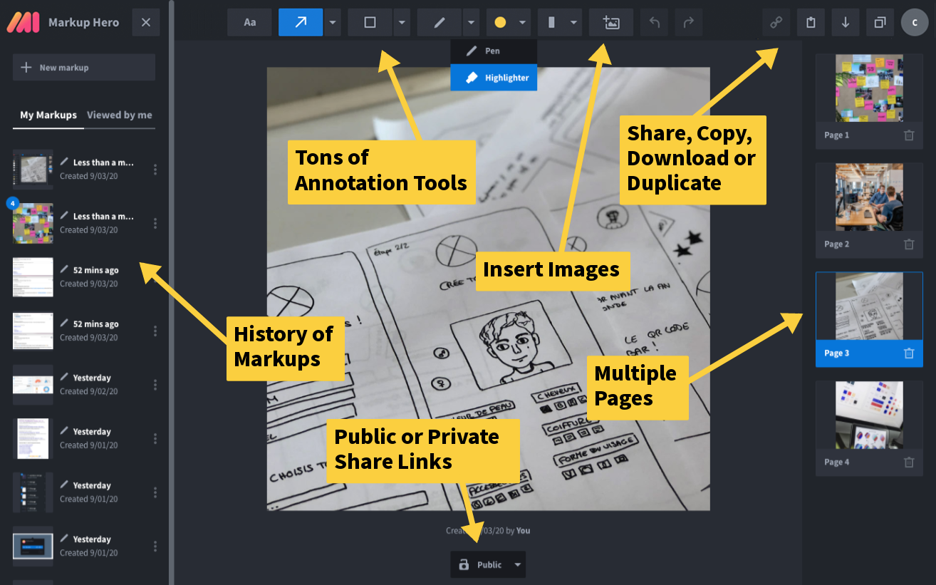
Use Markup Hero to communicate clearly, share feedback, give comments, and quickly explain ideas in your marketing materials. Whether for a blog article or social post, Markup Hero could be the simple design tool you are looking for.
PRO TIP: Markup Hero is free to try and you can build graphics in seconds. Nothing to install. Nothing to learn. No account required. Just snap, annotate and share or embed. Try it for free and see what projects Markup Hero can help you with today.
How to Incorporate Simple Design Into Your Marketing Strategy
Incorporating simple or minimal designs into your existing or new marketing collateral doesn't require the services of an expensive professional designer or boutique firm.
There are a handful of design strategies and techniques that anyone with a little guidance can implement.
Start With Minimizing Your Copy
While most people immediately think of graphics in relation to minimalistic design, reducing the amount of copy on your marketing materials is a logical first step in moving toward a more minimal approach.
Tackle your most important marketing pieces first and reduce the copywriting volume by at least fifty percent. Then, you can use revisionist tools to overhaul your writing to make it more straightforward and more concise.
Reimagine Your Color Schemes
Another simple way to move toward minimalism in your marketing is to reimagine your color scheme and branding. For example, if your current color palette has four or more colors, try to reduce it to two or three.
Use gradients or shading if you need additional depth and experiment with including white and black designs as part of your primary palette.
Evaluate Your Typography
While choosing brand fonts is typically glossed over and considered less critical than other visual elements, the typography settings can make or break a minimalist design aesthetic.
A key aspect of any design is typography, which is one of the most vital visual elements.
Beyond reducing the number of fonts you use, experiment with using a smaller font size where appropriate, change the placement of text to allow for more white space, and use bold or italics to replace a second or third font.
Together, these slight modifications can move your design toward a more minimalistic feel.
Favor Function Over Decoration
It's tempting to use the various cool plugins and features offered by many website platforms, but the best minimalist designs use the fewest elements necessary.
Ideally, you direct your user's attention to your core messaging and call to action, and the surrounding elements will support that message without detracting from it.
While animations have their place in design, there is a tendency to overuse these in many cases, resulting in a less than ideal user experience.
Embrace Negative and White Space
Resist the temptation to fill all of the white or negative space in your designs.
For posters and larger prints, leave an extra margin to draw the reader's eye to the center of your design and use visual hierarchy to lead them exactly where you want them to go.
The largest and boldest fonts should be at the top of your designs, followed by text in decreasing font sizes.
Consider increasing the spacing between your elements to make your design more legible as well.
While overlapping images and objects make for a cool design, they don't embrace the minimalist design style and can prevent the reader from fully experiencing the message behind your imagery.
Best Platforms To Create Your Own Designs
Over the past ten years, the DIY design movement has grown exponentially, primarily due to the expense of hiring a professional designer and the growth of DIY design tools that make creating simple designs more effortless than ever.
While a professional graphic designer can cost upwards of $100 per hour, most DIY design platforms offer a free or low-cost option that enables users to create flexible designs for everything from print, social media, and the web.
Let's take a look at four great DIY graphic design platforms.
Linearity Curve
Linearity Curve (formerly Vectornator) is for the designer who wants user-friendly design tools without the fuss of complicated menus. It's accessible, intuitive, and powerful without bogging down the user in hard-to-learn software or breaking the budget.
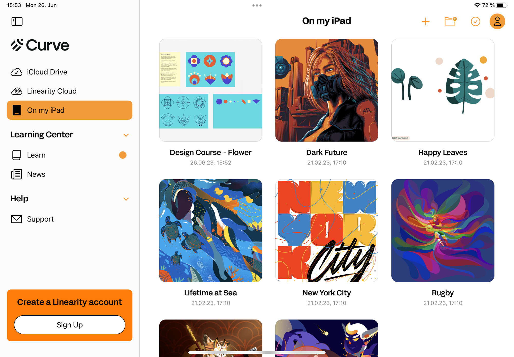
Unlike many other design platforms, Curve's mobile app is perfect for iPad with features like ready-made templates, a precision pen tool, gesture control, and more. Best of all, Curve's robust capabilities are entirely free.
Adobe Illustrator
Most professional designers prefer Adobe Illustrator when creating designs, yet Adobe continues to market its product suite toward beginners. Its in-depth tools allow for an endless array of design options and editing features such as layers, illustrations, and creating complex designs.
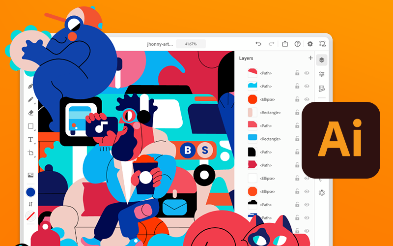
One of the most expensive design tools, Adobe Illustrator, can be difficult to use for many and have a steep learning curve, even for those versed in software applications.
This learning curve is likely to discourage some and force them to seek other, less expensive solutions.
Canva
Ten million people agree that Canva is great for presenting your social media works such as graphics, designing reports, video thumbnails, resizing images, and other simple designs.
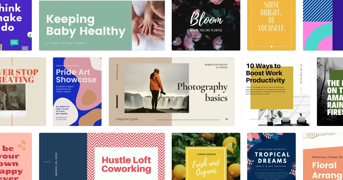
With explosive growth since 2014, it's one of the most popular DIY design platforms, and for a good reason - it allows non-designers to feel like designers.
Canva's template library is extensive, and they add new features regularly. Canva also makes it simple to do basic photo and video editing. However, it's not the best tool for designing custom logos or other graphics that need to be printed as a large size image or high-resolution since it's not vector-based.
While a free version of the software is available, many advanced features are only available with the Pro version of the software.
Wepik
Wepik is a free online design platform that allows you to create your own designs from scratch, or you can use their pre-made templates. You can also edit and customize these templates, which makes it a great way to learn how to use design software like Photoshop or Illustrator without having to invest in expensive software.
The best part about Wepik is that it's not just for designers. It's also great for entrepreneurs who are looking to create their own business cards, flyers, brochures and more.
The site has hundreds of templates available for you to choose from, including business card templates, flyer templates and more. They even have social media post templates so you can create your own posts in just minutes!
Visme
Visme began as a tool for creating animations but has quickly become a robust tool in the designer toolbox for all design projects, including infographics, social media posts, and flexible designs for use in blogs, websites, print materials, etc.
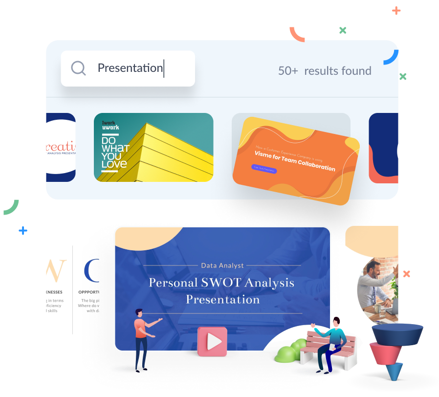
The Visme dashboard keeps track of a user's projects, and its visual elements prompt the user through a series of steps to create the designs, making it relatively easy to use.
It includes hundreds of elements in each category and makes editing templates a breeze with drag-and-drop style editing.
The free version of the app includes various templates and designs. The paid version, on the other hand, includes thousands of templates and design options.
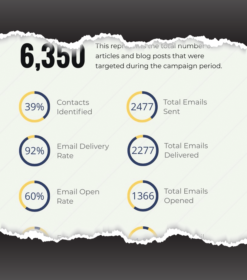
PRO TIP: See the full infographic above we built using Visme for our on content marketing guest post convert.com.
Examples of Simple Design
Minimal design doesn't have to seem like a basic concept or be boring. In fact, the best minimalistic designs make you pause and think, often reframing your initial perception of the visual elements.
These four examples are proof that minimal design is achievable and inspiring.
Leen Heyne's jewelry website is a classic example of minimal design with design elements that draw the reader to scroll the page and learn more.
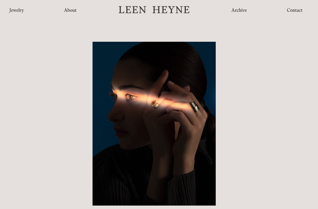
The home page is stunning, with beautiful images in the middle of the page that use a light source in a way that's intriguing to the eye.
The clean typography, monochromatic color scheme, and overall design are elegant and sophisticated, matching the brand's aesthetic.
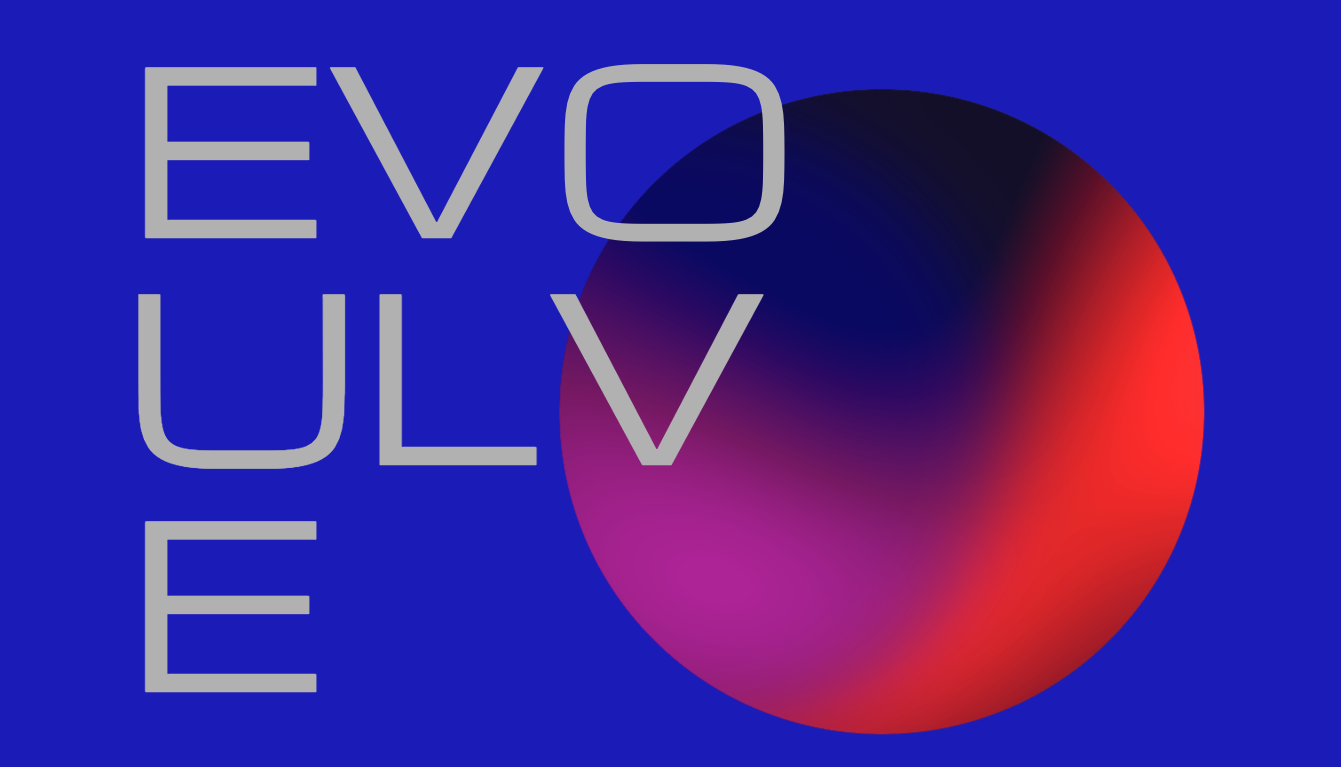
Evoulve proves that minimalistic designs can still be beautiful and include motion and bright colors. So it makes sense that a digital innovation company would take a minimalistic approach and do so in such a clever and appealing way.

The site uses a bold color scheme at the top of the page and transitions to a more monochromatic look with interesting typography and plenty of negative space to balance the moving objects.
Varnom Ross' logo is a perfect example of how simple structure and intentional design can partner to create a visual brand identity that conveys a company's overall mission flawlessly.
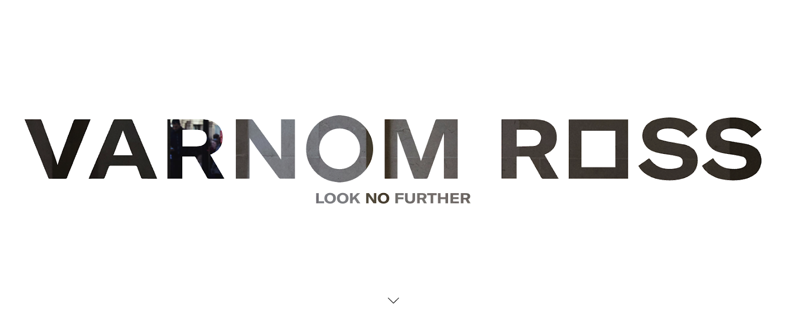
The designs of the box and the circle complement each other, signifying a sense of cohesiveness while being bold and powerful at the same time.
Apple arguably launched the basic minimal design concept and stunned the world with stripped-down white packaging, simple designs, and uncomplicated visuals.
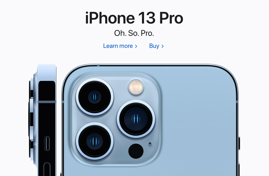
Their brand is among the most recognizable globally, yet their designs are simple, elegant, and almost non-eventful. Apple's marketing strategy reminds us that simple structure, beautiful images, and simplicity are here to stay.
Wrap Up
As you look around during your day, notice the abundance of minimal design in places you may have previously overlooked. Minimalistic design is everywhere - on the subway, at the grocery store, or in your local shopping mall.
While minimal and simple designs have evolved over the last 60 years, companies embracing the artistic trend continue to recognize the value of this approach.
From giving readers more clarity around messages and themes to communicating the brand identity through visual elements and typography, simple design accomplishes what other design techniques cannot.
- By incorporating some of the minimal design techniques into your marketing strategy, you can begin to experiment with your own version of minimalism and gauge the results for yourself.
- Begin small with typography or images and grow into other concepts like embracing white space, valuing function over features, and reimagining color schemes.
And thanks to design platforms like Markup Hero, Visme, Canva, and Vectornator, you won't have to spend your entire marketing budget to make these subtle changes.
Consumer expectations will ebb and flow over time, forcing minimal design into different forms in order to keep up with the market.
As a result, the most successful companies monitor the movements, adapt to changing environments, and remain flexible while staying true to their core mission, values, and identity.