Planable Product Review
If you've ever had to manage numerous social accounts across several business units you've probably realized how cumbersome it can be. Like me, you've also probably found the process to be prone to errors and inconsistencies. There are tools to help you manage and schedule social posts, and I've tried a number of them.
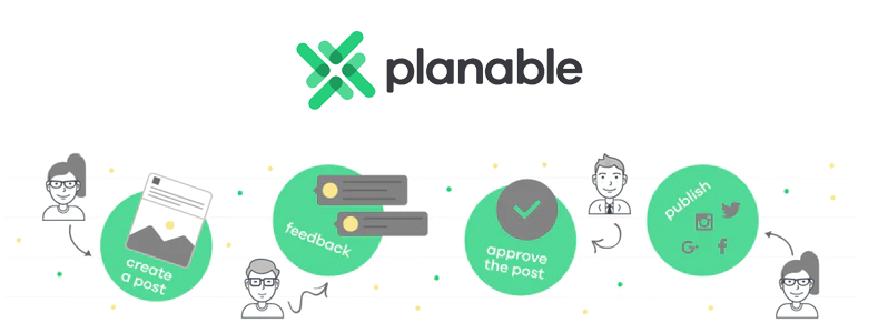
But I recently found a product called Planable that flips social media management software on its head. Their centralized hub for creation, collaboration and releasing social content is pretty impressive and might be just the solution you've been looking for.
The thing about social media management software is that they're often overkill for smaller organizations or companies with lower volume of social posts. It's pretty clear that marketing agencies can't really live without tools like Planable, but what I'm loving about their solution is that it's entirely useful for startups too.
While the tool does have a lot of functionality related to approval reviews and team management, it's content creation and scheduling tools are so slick you could skip the collaborative features altogether and still get way more value than the Starter plan at $33/month will cost you.
Managing your social media campaigns and tracking analytics can be overwhelming. So let's take a look at Planable to see how they can help you do more with less stress. And being that I'm mostly a startup guy, I'm going to largely focus on Planable's features that are universally useful to small and large organizations alike.
Getting Started with Planable
Unlike many SaaS tools out there, Planable offers a completely free version of their product. It is limited to 50 posts so eventually you're going to have to upgrade to the Starter plan, but by that time it's going to be quite clear why it's worth spending $33/month to keep using the platform.
I love companies that spend time to create fake, but completely useful, test data to play around with after signup. After creating an account, I was dropped into a sample workspace for a fictitious business called Justco.
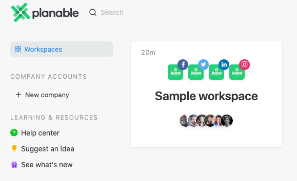
At present, Planable supports Facebook, Twitter, Instagram and LinkedIn. And the Justco workspace is chock full of great content, designs and posts for all four of these social platforms. I found it incredibly helpful to wrap my head around the Planable feature set and their overall social media management philosophy.
After a little time playing around with the sample workspace, I was ready to create a workspace for Markup Hero and take Planable for an actual test drive.
Setting Up My Own Brand
In Planable, I can setup "companies" and "workspaces". Each workspace is used for a different brand within the same company. This is particularly relevant to agencies that manage more than one company or brand, but there have been cases where I managed multiple brands and social accounts for the same business. These days I'm focused on a single brand for a single company which means the free and starter plans will work just fine. I can actually have as many companies and workspaces I want in the free plan, I'm just limited to 50 total posts. When I upgrade to to Starter, I'll get unlimited posts but only 1 workspace. If I need more than that, I'd have to jump to Premium (unlimited posts, 5 workspaces) or Enterprise (unlimited posts, custom # of workspaces).

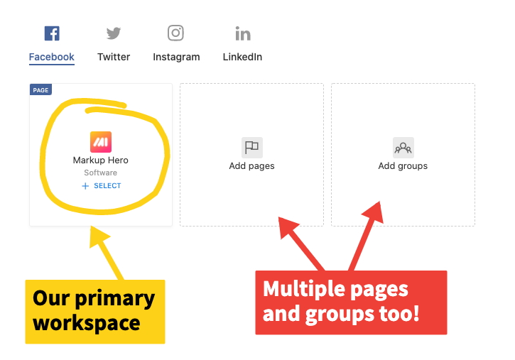
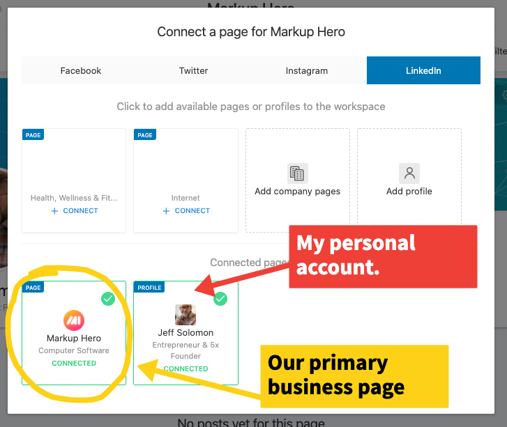
Adding my social accounts was effortless. In my case I only manage one Facebook page for Markup Hero, so that's all I added, but I was surprised to see I could add multiple pages and groups under the same workspace. This was also the case for Twitter, Instagram and LinkedIn. So basically, one workspace can handle as many social accounts as I have. So it seems I'd only really need more workspaces for entirely different businesses.
For LinkedIn I'm able to add my company page, but also my personal account. This feature is actually quite useful given that our LinkedIn page is new and doesn't have much reach. So I often use my personal account to amplify the reach of Markup Hero's social posts. And as I'll get into later, scheduling posts for each platform is so easy I'll be able to effectively manage my personal and business accounts across each social network.
Creating and Organizing Social Content
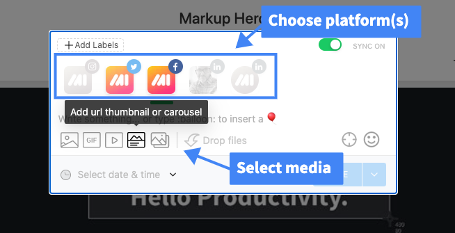
Planable has done an amazing job making the post composer look and work almost exactly like their respective editor in each social platform. I'm able to select one or more connected accounts and compose a single piece of content and it's automatically formatted for each platform. For example, I started composing a Facebook post and could instantly add LinkedIn without having to make any changes. And if you are tracking hashtag performance or competitors, it's easy to leverage that data too when composing social posts.
The tool gives me several ways to get media into my posts. I can simply upload an image or video from my computer, search for a GIF (built-in) or select from the media library. And I can even enter a web url which pulls the meta data and OG image (just like it does on Facebook or other social platforms). Bam!
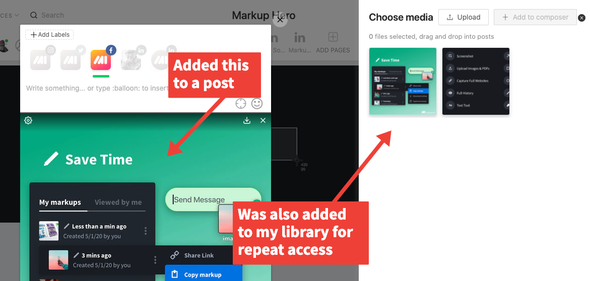
Love This: When I upload an image or other media it's added to the built in media library for future use automatically. I can easily add/remove assets in the library so over time I'll have all my reusable assets in one place without having to hunt for them on my computer or across a shared cloud drive.
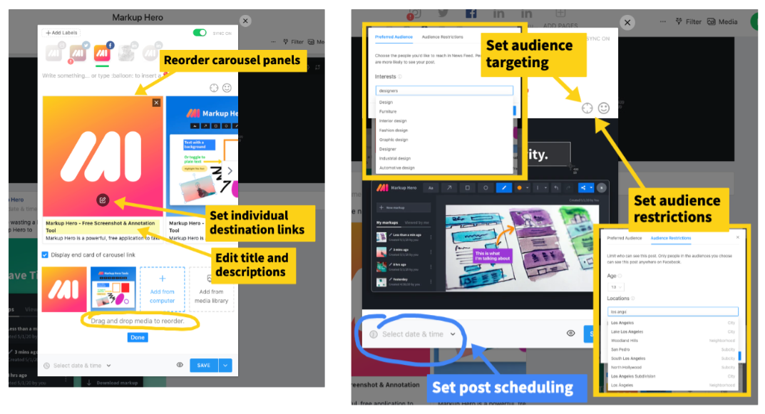
Once I have a single image, video or gif added, I can quickly toggle to carousel format (for social platforms that support it) or just multiple attached media files. Again, I can add more from my computer or media library. And just like in the social platforms I can add audience targeting or restrictions.
Once I've created a few posts, everything is displayed just as it would on the corresponding social platforms (i.e. the feed). The Planable team has meticulously designed the interface to perfectly reflect the real thing.
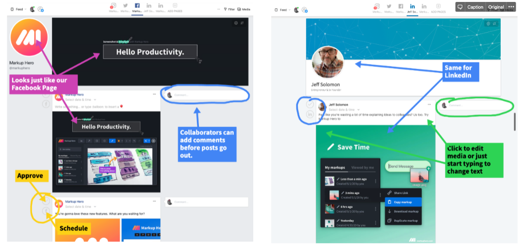
I can easily imagine the value for larger organizations who are managing multiple accounts and multiple posts per day. But being part of a small team where only one of us generally does our social posting, I initially thought that a tool like Planable would be overkill. It's not. One thing that's always been true when running social accounts, whether a small company or big agency (I've done both) is that I end up changing my mind or realizing I missed something. I frequently go back and edit posts after publishing them. And even though Facebook and the rest have the ability to create a draft, I generally didn't use it. By default I think of social posting as a binary action — I'm posting or I'm not posting.
With Planable, my philosophy around social media management is altered in the sense that I look at it more holistically. I can create a bunch of stuff and just let it sit there for a bit. This gives me time to reflect and tweak until I'm ready to publish. Then I can click a button and it all goes out together, or stagger it with scheduling. It's actually much more natural now that I think about it; not unlike writing a blog post. I rarely just bang out a post in one go. I generally start writing, make some progress, then step away, work on other things and come back. This approach tends to lead to better content because I have time to let my ideas percolate. Why can't that be the way I social post too?
Views, Organization, Scheduling and Review
Earlier in this article I mentioned that I wouldn't be covering much of the review or collaboration features because we're a small team right now. But after using the product a bit more I actually see the benefits for our team of three. I'm easily able to invite a collaborators, which I did. Usually the two of us are posting in a silo. This works ok, but now the we're able to see what the other is working on. In several cases we each had feedback for one another that lead to better content. For larger organizations the collaboration might be partly around building better creative, but also for approvals and QA. Those things aren't mutually exclusive it turns out.

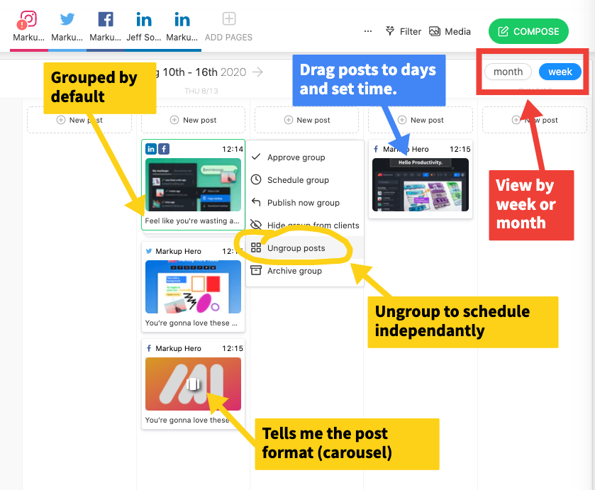
The feed view is great for seeing how my content is going to look on each social platform. Whereas Planable's calendar view is designed to manage my posting schedule. Again, this is something I didn't think I'd find useful in a small org, but that wasn't the case either. I've got quite a bit of control from the calendar view. I can easily drag posts between days, toggle social platforms on/off to update the view, display by week or by month and a bunch of other actions.
I liked how a single post that was created for use on multiple platforms got grouped together by default. In most cases I would just schedule those to go out at the same time/day. Though in some cases I might want to schedule them independently for each social platform. I can quickly ungroup and drag to schedule. I've learned that sometimes I can boost engagement when I stagger the same post across multiple social platforms. People tend to ignore the same content if they see it twice in a short period of time, but when it pops up over multiple days it works better. I call it delayed repetition, something I just made up and my observations are anecdotal, but I do think it works in some cases.
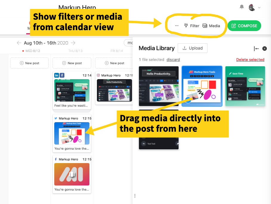
Love This: The Planable team really cares about details. From the calendar view I'm able to quickly just drag additional media to posts without having to edit. It's a little touch but it's so slick.
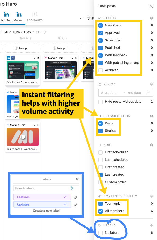
Calendar view is also a great way to manage review and approvals; and with deep filtering it's effortless to organize and find posts. I particularly liked the labels feature which allows me to organize posts by type: Updates, Features, Partners, Content Features, Customer Development, etc.
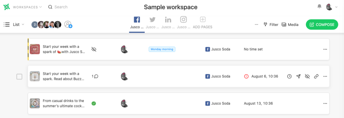
Planables Grid is somewhat less useful as far as I can tell, however I really like the List view which gives me a birds eye view of my post schedule. I found it easier to discern the key aspects of my posts and the schedule drumbeat. I can see who's posting what, where they're posting and when. This would be incredibly useful for orgs with numerous people doing posts with high frequency.
And tags come in handy here so I can look forward (or backward) to get a sense of post type density. For example, I like to post product updates, partner features (i.e. when other companies mention us in a blog post/article), customer development (i.e. when we're looking for feedback from users), and general value add content. I don't want to over-post any one type on any one platform as to not annoy our followers. The list view is a really effective way to see this density over a period of time for each type.

So Much Attention to Detail
I've already pointed out a few aspects of the software that demonstrate how well built Planable is. The user interface is clean, straightforward and flexible. I'm able to manage various aspects of the system, from creation, scheduling, feedback and approval from multiple vantage points. This applies to different views, but also from various editing screens. For example, scheduling can be done from the content composer screen, inline on the feed view, from the editor modal and a half dozen other places. Media and copy can be changed from multiple locations as well as comments/approvals. This all speaks to the Planables design thinking. They know that social media management can be overwhelming just on its own. They've designed their software to work the way people work — dynamically and from multiple angles.
Little things like using CMD + Enter to save a comment in addition to the submit button. Or the right click menu that appears in just the right spots. And the speed with which I can move around between views, creatives, social platforms and more really makes using Planable a pleasure. I was grateful to find the tool has nice little alerts when I try to navigate somewhere that might cause me to lose some work (like in the middle of editing a post).
Would Be Nice: I attempted to use CMD + Z to undo a few things which didn't seem to work. I can see how it would be difficult to have an UNDO for everything, but certainly it could be implemented for some functions like commenting or triggering a post approval.
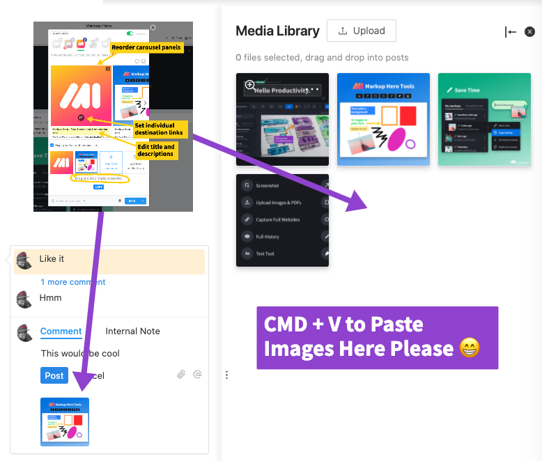
Additionally it appears CMD + V doesn't work for media in my clipboard. This would be super handy for adding to the media library and comments... especially to add annotations ala Markup Hero annotations😜.
Conclusion
There is a lot more to Planable than I've covered in this review. I've really only scratched the surface. But I think I've showcased enough to demonstrate the tools power, flexibility and simplicity. Turns out the software is actually more useful for smaller teams than I originally thought. It's pretty clear that we're going to surpass the first 50 posts limiter on the free account fairly quickly, but everything worthwhile costs. The $33/month starter plan is more than enough for our team to keep jamming for the foreseeable future.
Of course if you're running an agency or you've got a multi-layered corporate culture, then Planable is a no brainer. One note on that front, I imagine if you're looking at using Planable you've either tested some of their competitors or plan to. They have comparison pages to four popular solutions: Buffer, Gain, HeyOrca and Sprout Social which do a great job demonstrating why you should choose Planable over their competition.
And check out Planables content marketing white paper which can be downloaded from their website — it's wicked well done.

