Toggl Plan Product Review
Toggl Plan is a project planning solution from the popular Toggl company who makes a widely used time tracking tool. I've been a Toggl user for years and find it to be the best out there. Specifically I've always been impressed with the ease of use, smart UX and how it's so valuable for single users for free! I'm eager to see how Plan stacks up.
According to the team, Plan has been around for a while as a separate product called Teamweek, still under the parent owner Toggl, but they re-branded to Toggl Plan in February. This sounds like a smart move given the trust and reach that Toggl has already built with their time-tracking customers.
The Website
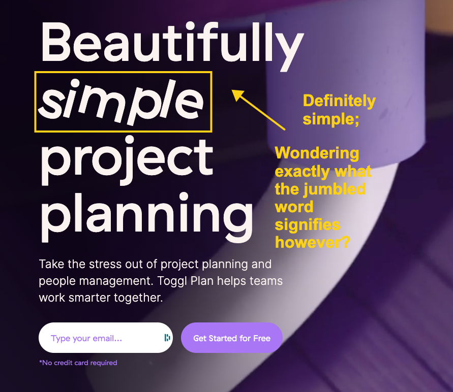
Well you can't go wrong with the purple motif Toggl Plan uses. From the get-go, visitors are shown the core benefit of the product is simplicity and ease of use. This will probably resonate with a lot of people (me included) because project management software can be a total bear. Old school software like MS Project and even new-age tools like Monday.com are pretty darn bloated and overly-complex for many users. Toggl Plan offers a fresh approach to simplicity that might just fit the need for sizable audience.
The product is competitively priced at $8.00/month per user and they have a free version for solo users with a limited feature set. Again, this is going to appeal to a large user base considering Monday.com and others start in the $40/user per month range. On the product support front, Toggl Plan has a nice knowledge base with a pretty deep set of help articles. They seem to have opted not to use the chat support module and only offer email ticketing. I'm a fan personally of the chat support, but there is a big debate among product teams right now around the efficacy of chat support (but that's another topic for another time).
The Product
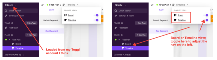
By default I was shown a traditional "Timeline" view, but there is also a "Board" view that appears to still be in beta. Seems like I can have as many plans as I want, which is shown on the left side vertical bar, as well as multiple teams.
Settings
The architecture of Toggl Plan not so dissimilar from Toggl time tracking where I'm used to Teams and Projects. It took me a minute to figure out I could also have multiple workspaces, which is controlled from the Settings page along with a range of options like notifications and timeline preferences.
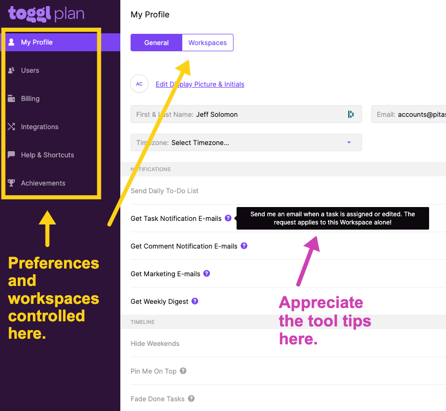
LOVE THIS: A small detail here is the tool tips throughout, which gives me just enough info about particular settings. I like how the Toggl product team really pays attention to the little things that not only help me get a hang of their product faster, but also keep me from having to search the help documentation for simply Q&A. I would expect as Toggl Plan grows in functionality they'll continue to incorporate many of the little touches I've come to appreciate in Toggl products.
Integrations
I was pleasantly surprised around the integrations that Toggl Plan offers. This is usually something that gets added way later in a product lifecycle; perhaps they had already built some of this with the original Teamweek product. In particular you can easily import tasks from Trello, GitHub, JIRA, Asana, Bitbucket and Podio using their Firefox or Chome extension. This is a nice bonus for some of the more technical users. There is a Slack integration that gives you notifications of changes and daily to-do lists as well as a iCalendar link to incorporate your timeline into your Google Calendar or other service. And they offer a developer API but I didn't look into how deep that goes just yet.
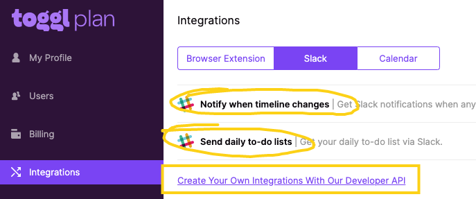
LOVE THIS: While they don't have a formal Slack plugin, they do offer a Google Chrome extension which enables me to copy text from anywhere in my browser (email, Slack, etc.) then right click > Add to Toggl Plan. This is a simple way to get content into my Plans.
Timeline View
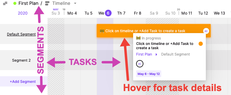
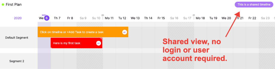
The timeline view is pretty straightforward. You have "Segments" of a plan going vertically down the left side with "Tasks" going horizontally within each of the defined segments. As you add more tasks that overlap the time/day ranges, the segment line expands vertically to accommodate. As expected, this is all very slick with no latency, misfired clicks or positioning conflicts. I noticed they gave me a default segment and default task to get me started which indicates I can add new tasks either by just clicking the segment row (which is likely the typical way to do it) but also by clicking +Add Task — but I could not find that button anywhere?
Update: Heard from the Toggle Plan team they're looking at adding the button on the timeline view as well, yay!
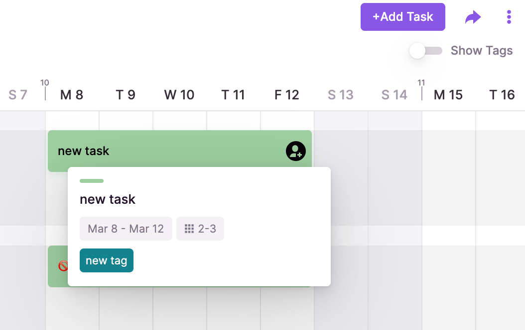
UPDATE: In my original review I found it a little odd that the tags don't show in the task hover box as shown above, this has now been fixed!
Update: The Toggle Plan team did this one, woot!
Board View
As I mentioned, this feature appears to be in Beta. I'm guessing it was driven by customer feedback as I suspect a lot of things will be for a product like this. Board View is a kanban style interface. Note that the columns are organized by Status only which again I suspect is by design. This is a logical addition to the product because it opens the use cases far beyond project planning. With Board view, Toggl Plan can just as easily be a task management tool like Asana or Trello. In this view we don't have a mouseover detail hover because the cards essentially show the same info as the hover in Timeline View. But with more room, the tags show by default.
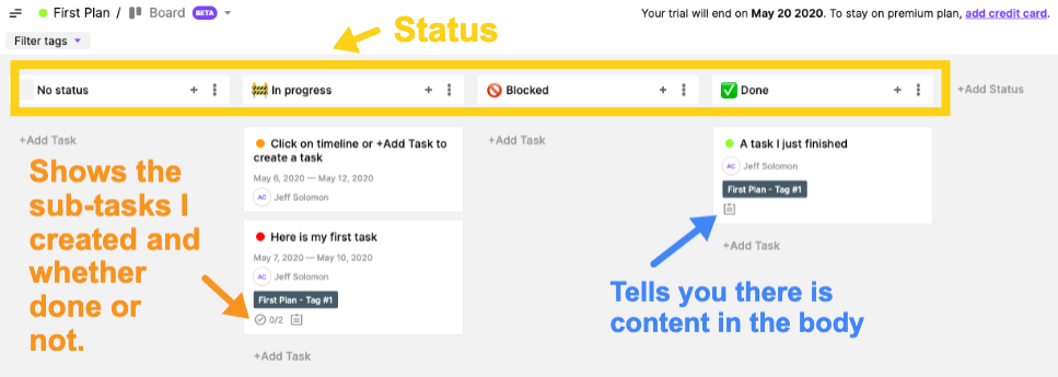
I like how most of the information I need is shown on the card (if it exists) as well as an icon indication if I have sub-tasks and content in the body of the task. Of course you can drag tasks between status columns as expected and there is an action menu to move all tasks from one particular column to another.
QUESTION: One thing I'm not clear on, and maybe it doesn't matter, but if you're using both Board and Timeline Views for a particular plan (vs. just using one for one thing and one for another thing), how do the Segments come into play in Board View? I'm thinking maybe there is a way to filter the Board View by Segment like you can with Status, but not sure exactly how useful that would be.
Update: The Toggle Plan team suggested segments aren't intended to affect board views directly, but rather change how they display on the timeline. This makes sense.
Tasks
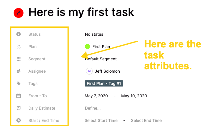
Tasks are simple enough, but powerful at the same time. The interface has a very Notion-esque look to it which I was happy to see. Typical options like Title, Status, Assignee, Date/Time Ranges and Task Details are included. You can change the task color but all the other attributes seem to be fixed meaning you can't add custom attributes like many other products offer. Even the status options appear locked: In Progress, Blocked, Done.
I'm guessing this is the topic of much debate in Toggl Plan team because on the one hand, I love the simplicity here. Tasks have 8 attributes, that's it. Every task is the same structure from plan to plan, workspace to workspace. If I'm given the latitude to create my own attributes, yeh, I gain some flexibility here and potentially cover more edge cases, but the product loses some elegance. It will be interesting to see if the product sticks to this decision as it's a big one and not one that is easy to go back to if a decision is made to opt for flexibility. I guess it can be a feature of a higher paid plan, or maybe it already is and I didn't see, but I still love the simple elegance here and my current vote is not to allow this.
Also included is a tagging option that selects a default color for you, but you can easily change. I was particularly pleased to see that the tags are unique to plans vs. global. Some tools like Evernote for example have gone with Global tagging vs. Notion which has note or database specific tagging. My preference is the latter because things just get way out of hand when tags are shared across your entire workspace. You can easily filter the timeline by tag(s) and even show or hide tags directly on the timeline, although this feature probably won't get used by people as the tasks just get too cramped to read anything.
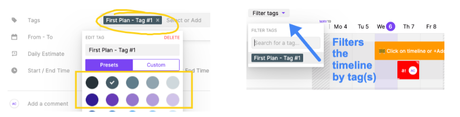
A NICE TOUCH: When you filter the timeline by tag, then attempt to make a task with that filter enabled, the task defaults to the current tag(s) selected. Minor detail of course, but actually saves quite a bit of time if you're a heavy tagger like me.
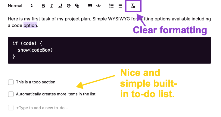
Users can add comments and @mention another user which presumably triggers notifications. And the task body section is flexible but simple with typical markup tools of a blogging platform like Bold, Italic, Underline and Strikethrough as well as some power features like quoting, code blocks, numbered and bulleted lists and a clear formatting button. Took me a minute to figure out what that one was actually and doubt most users appreciate the utility of that one. Maybe some tool tips on the options here would be useful. I also liked the in-line to-do section. They might have opted to incorporate a more sophisticated to-do list with assignments and all the other goodies you might find in a "Sub Task" (ala Asana). But honestly, I'm beginning to like the decision making the team has made on not over-bloating this thing. The fact is I'm looking at a task, I really don't need to have even more tasks within the task itself. A simple checklist is sufficient, I agree.
Update: The Toggle Plan team confirmed @mentions will trigger email notifications of any updates. And, you can become a follower by either: being the creator, being assigned the task, adding a comment, or manually adding yourself as a follower. And bonus, they now do in-app notifications for this.
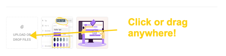
Finally you can attach files to any task. This is simple, just click to browse or drag to anywhere on the task (nice touch) to attach.
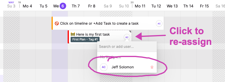
Another slick little feature is the ability to re-assign directly from the task card. Although, this only seems to work on Timeline View and not Board View.
Sharing
It appears you can share at the task level as well as the plan level. Sharing a task is done from the action menu on the task details modal. Whereas sharing the entire plan happens from the share icon at the top right corner of the plan page.
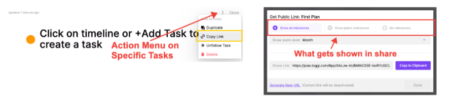
When sharing an entire plan, you get three view options: Show All Milestones, Show Plan's Milestones, Show No Milestones. But I got a bit lost here as I'm not quite sure what a Milestone is exactly. I haven't seen that terminology anywhere yet and when I compared the link with the 3 different settings, the shared page looks the same. Note, this could be a user error given that I'm just trying this for the first time. But putting that aside for a minute, I love that I'm able to copy a share link that does NOT require a user to login or create an account to view. However, this does not appear to be the case with sharing individual tasks and I'm not sure why. I actually think sharing tasks without login requirements is even more useful (at least for me and those that are using this as a task tool).
Update: The Toggle Team confirmed milestones are a visual way to see when significant things are happening. Typical use cases could include: a new hire starts, a major deadline, a feature release, a final draft is due, and so on. The things that come to mind when you think of project milestones.
WOULD BE COOL: Certainly making the task sharing no login required is at the top of my feature requests, but also I see that when you share a link in Slack or another place where the OG image would typically show, Toggl Plan is showing a default image and title. It would be slick if that had some relevant meta data, either a uniquely rendered OG image (in the case of tasks) and/or a title and description that matched the plan or task data.
Other Things
Toggl Plan has a number of other little goodies sprinkled throughout and you can tell they are iterating regularly with new features from feedback and from the good old vision board. From the top most action menu, you get a few more options. You can edit some basic plan settings and favorite/unfavorite plans which shows up accordingly on the left nav bar. And you have the option to duplicate a plan, archive or delete.
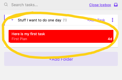
And finally, there is this little inbox icon up in the top right also that opens an "Icebox" akin to the agile term popularized by Pivotal Tracker. This functions as one would expect, a sort of catch-all for tasks that are not ready, backlogged, whatever. You can make folders here too so these tasks can be organized as well. I like that you can still access the task details without having to put the task back into a plan. You just drag to-and-from the plan to the icebox to move tasks around.
Final Thoughts
I'm not quite sure how good the original product Teamweek was — if Toggl Plan is the same tool with a new brand or if they built it from the ground up. But it does look pretty current so I'm guessing at least some of it was built more recently. As I shared I also expect the Toggl Plan team is iterating quickly and we'll see more features (maybe even the ones I suggested) come online sooner than later. In fact, I noticed on their jobs page they're hiring a Product Lead and Senior React Dev so they're definitely in build mode.
I'm a big believer in simplicity as a market. In other words, just because there are entrenched products in certain categories like Project Management, that are feature rich, bloaty and enterprisey, doesn't mean there isn't room for a simple alternative. In fact, I believe that situation almost always creates a product-market-gap and it looks like Toggl Plan is targeting that. In fact, one of the team leads at Toggl Plan even told me directly:
"When comparing to something like Monday.com... put simply, if someone needs all the crazy amount of features that Monday offers, then they aren't our target market. People who use Toggl Plan are looking for a simpler solution that's quick to keep updated, cheaper, and easy for the team to get on board with and wrap their heads around."
That resonates with me and likely a lot of other people too.
Hope this was helpful and insightful. I often find myself finding and testing new SaaS products as it's something I really enjoy. The screenshots and annotations in this article were built using Markup Hero. This too is a new tool but growing fast — working especially to differentiate from the somewhat stale screenshot and annotation space where there are dozens of solutions, but not a ton of innovation in years. Like Toggl Plan, we're trying to keep the bloat down and utility and speed up.
Try Markup Hero for free, no account required for your next how-to or product walkthrough article. Or click here to see an example markup from this article you can play with.