Spike Product Review
Spike (spikenow) is a really interesting tool for communication and collaboration. They say "Spike helps teams stay connected with conversational email, chat, video calls and collaborative tools built into a seamless, powerful inbox." — It's kinda a mashup of Slack and Gmail and I immediately saw the utility over using just those solutions.
The Website
First let me say I'm quite impressed with Spikes website. Like their app, it's very clean and well organized. But more importantly, they have a ton of content there to help new users see the actual benefits of their product vs. simply listing out features. This approach "benefits vs. features" is obvious and well known to SaaS marketers, but like most things, easier said than done. I've struggled with showcasing benefits over features while still articulating the feature itself on many occasions.
They have a section on their site called Resources, which outlines some key how-to's and comparisons to products people are already used to.
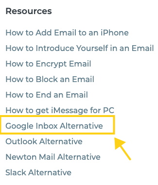
I was particularly impressed with this article that doesn't slam Google Inbox, but elegantly shows how Spike fills gaps where Google Inbox is lacking. As an example, I did like the in-line replies of Google Inbox, but continue to be frustrated with scrolling and expanding, even in Gmail directly. The idea of a Slack or iMessage style interface has always been appealing.

Of course, Spike does have a features section which effectively intertwines the benefits into the feature — and to somehow get a Pulp Fiction reference in there without getting an R rating is impressive!

The use cases are quick reads and organized by role — although you have to scroll to the bottom nav to see the roles. Maybe include those on the use cases page at the top as well.

The Product
Let's get into the product now shall we. First, the Spike team has done a great job making the product universally accessible — web, mobile and desktop. I'm pretty partial to desktop apps on my Mac so I immediately downloaded that.

Installation
The install process was seamless and it looks like the app is signed by Apple so I didn't get that annoying and concerning developer security popup that most people don't know how to get around.
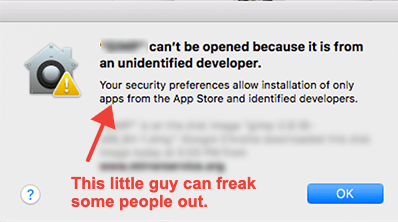
Once installed, I had to connect an email. I went with Gmail and this part can be a bit concerning for people.
WOULD BE COOL IF: Maybe the Spikenow guys can figure out a way to let people play with the product in a demo account format of some sort first to get them comfortable.
The Messaging Client
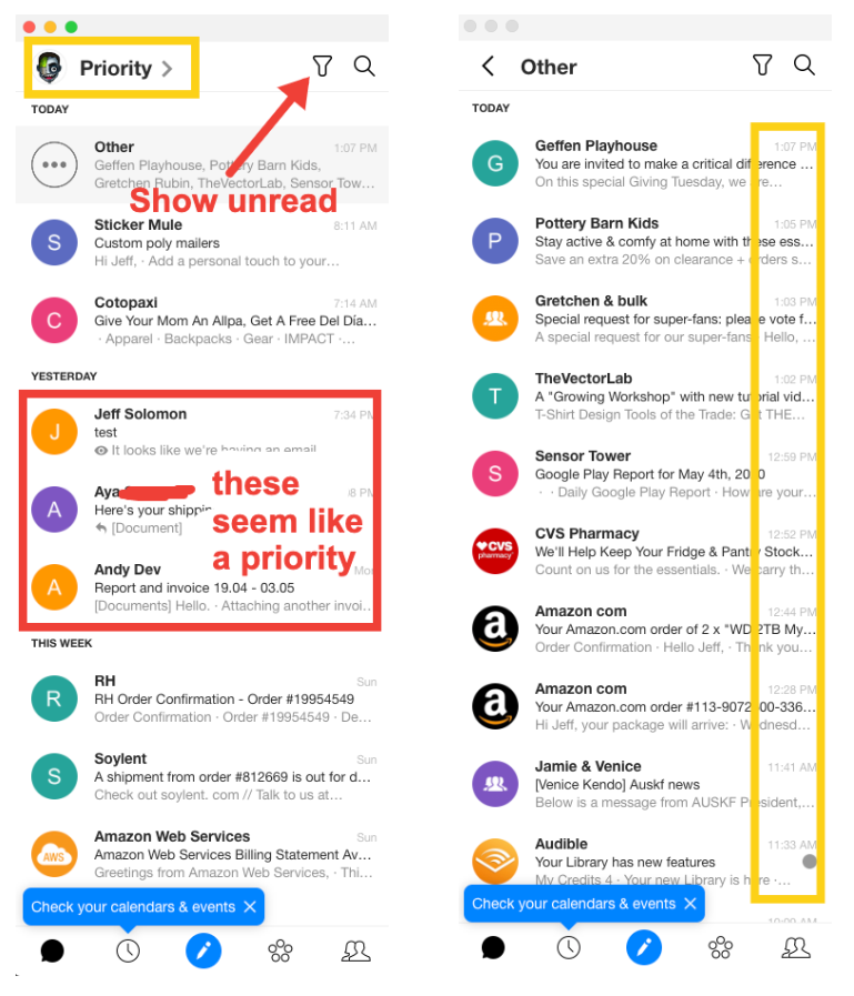
The tool does indeed look like an email client and messenger client combined. The first thing I noticed was this toggle between what they call "Priority" and "Other". I'm guessing they have some logic that suggests certain conversations should be included in priority, but not exactly sure how it works. Note that I'm using my catch-all email for this test, so I wouldn't say anything is a priority over another email address. But it does look like it pulled out emails from yesterday from actual contacts of mine vs. sites like Soylent or Restoration Hardware. The "Other" tab seems more like a traditional chronological view of emails.
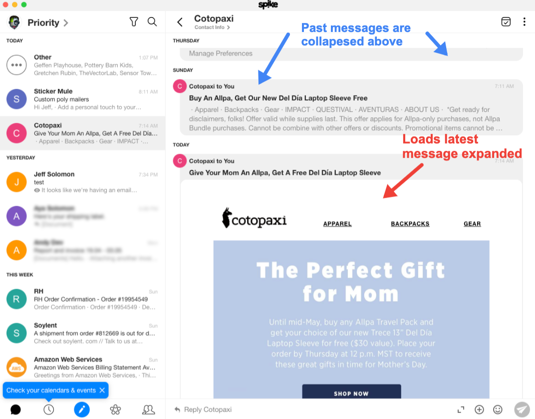
When you actually click on a message it loads to the thread to the right as expected. I particularly like how the open and collapsed states work compared to Gmail. I always find it hard to locate a particular message from a thread in Gmail. Is it at the top, the bottom, some threads show a little bit of the message, some just say expand.
BEAUTIFUL: Spikes interface is clean and bubbly and very easy to navigate.
I very much like the action menus shown on a message thread. Specifically that they give you similar options as they relate to the entire group of messages and the individual message like star, move, mark unread/read, trash, archive (as shown below). They have all the same things that you would find in Gmail and then a bunch of features you would find in a Gmail plugin like Mixmax for example. Things like "followup/reminder time", mute and pin, which is really useful for quick access vs. using star which I tend to use for later followup. Also note that this action menu can be controlled with a right click, which power users will appreciate. In fact, the whole platform is very slick in this way. Everything has hotkeys which show up as hover menus and many things are accessed from multiple locations and right clicking.

LOVE THIS: I like the distinction between "PIN" and "STAR" as that suits my workflow. Star is something I'm tracking for days or weeks. Pin is something I'm tracking for minutes or hours.
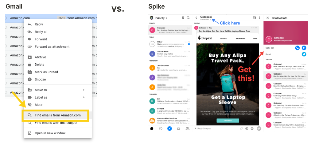
Another little gem I found is clicking the from name on the top of the thread panel to load all messages from that user. You can of course do this in Gmail either by searching or right clicking the message and saying find emails from Sender. Spike Now handles this much more elegantly. Plus, you instantly see threads and files grouped separately, which is really nice.
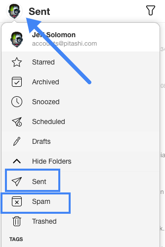
One thing I couldn't find at first was some of the typical email functionality. Things like Folders: Sent, Archived, Scheduled, Drafts, etc. and a variety of settings. Most of this are found in the main menu off my avatar, but I'm guessing thats by design because the philosophy I'm starting to feel from Spike is not to think of it as an email client. So those typical folders I'm used to going to in Gmail, while still there, are not front and center. More on the "Conversational Email Philosophy" below.
Search
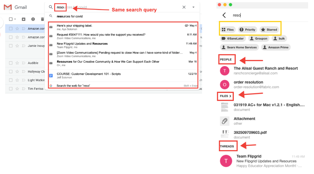
Searching in Spike is fast, faster than Gmail even. Results are generally as expected, but two aspects stand out. First, there are 3 quick filters for "Files", "Priority" and "Starred". These adjust the results instantaneously. Second, the results are automatically grouped by "People", "Files" and "Threads". Comparing the same search in the same inbox on Gmail, you can see the results are completely different. From my perspective, Spike results seem way more useful. In particular, even when completing the search on Gmail you get some additional filters like "Has Attachment". But actually showing me attachments (Spike) vs. emails that have attachments (Gmail) is more logical.
WOULD BE NICE: Spike doesn't seem to show a recent searches history; I actually find this really useful so would be cool if they added it. At least the last 5 searches to start.
The "Conversation" Philosophy
Spike hammers home this idea of "conversational email" which is their term for merging email/chat. So far my experience with the product has been in a silo so generally Spike has felt like a very well organized email client that looks more like Slack. But I don't think that's exactly how the company wants people to see their product. My sense is that while my testing of Spike thus far has felt slightly more "conversational", the real power comes in when the product is used with teams.
With One User on Spike Only
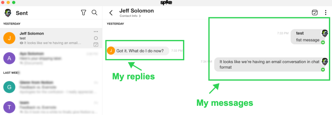
To begin testing this, I sent myself an email to another address where I was not using Spike. The experience on the sending side was indeed just like messaging. You can see from the Spike interface, it looks like a chat conversation.
But when you look at it from Mac Mail in this case, it's a traditional email conversation.
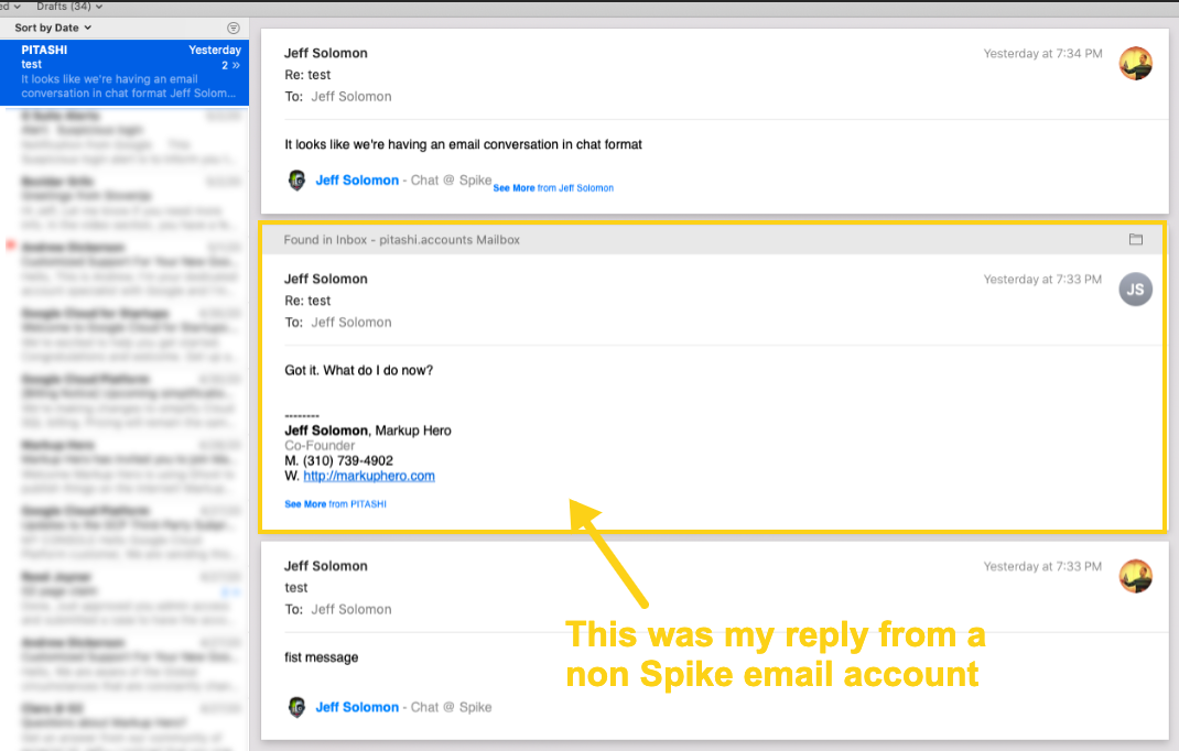
This is obviously important because it allows users and teams to communicate easily with anyone using email. Comparing this to Slack, if you're not on the same team in Slack, you're outside the silo and it really can't be used. The Spike team does a great job articulating the challenges of using Slack vs. using their product in this article here.
WOULD BE NICE: Here's something I've been thinking about for years. We've all seen email conversations that go back and forth for days with hundreds of messages, just like chat. This is where iMessage, Slack and now Spike help. But I've always wondered why participants in an email conversation can't instantly jump to a chat conversation with one click, no login, no user account creation, just a pseudo-anonymous chat conversation that lives only on an obscure URL that is clicked from the footer of the email.
Spike does add a little message at the bottom of the email suggesting that I "chat" with Jeff which opens up a funnel to get me to signup for Spike. This is logical and fine, but it's a pretty big barrier for me to get started. I think the experience that would be better is that I could click that button and be taken immediately, without logging in, to a web client that showed the messages in chat format just like Spike does. From there I could instantly begin chatting with the other user that is on Spike. Eventually I might convert, probably at a higher rate, to a Spike user. But more importantly this flow would enable me to get out of the "thread" as Spike likes to say and start a real-time messaging conversation — basically what I described above.
With Both Users on Spike
Now let's try it with both people on Spike, sure enough it's just like chat, real-time.
User 1 - Web Interface
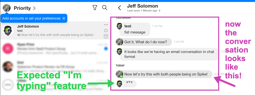
User 2 - Desktop client

WOULD BE NICE: I prefer the more traditional "left" and "right" chat structure of the desktop client vs. the web client, but that's minor.
With Multiple Users in a Spike "Group"
Ok, and finally let's use the group feature of Spike which is basically the same thing as a "channel" in slack.
User 1 - Web Interface

User 2 - Desktop Client

Final Thoughts
There is a lot more to Spike, it will surely take me time to get to all the nooks and crannies. But on initial testing, it does fill a lot of gaps in my workflow which is largely Gmail and Slack right now. Moreover, they've integrated the Google Calendar into the application in a much slicker way than Gmail does, but you can download and test that for yourself to see how.
The whole "Conversational Email" is really smart. Clearly Slack tapped into a huge pain point with team based messaging vs. using primarily email or other fragmented tools inside an organization. But Spike is flipping that paradigm a bit and I really like how the product works both with and without a team. For millions of us that aren't 9-5 with one company for 20 years straight with the same people, in the same company with one email — Spike offers a great way to communicate in a multitude of ways with many different teams, freelancers, friends, companies and more.
BONUS: I just got the updater notification for a new version of Spike which was ultra smooth, a small detail, but that's what I've come to expect from the product and engineering team at Spike now. They've set the bar pretty high for themselves.
Hope this was useful; I do enjoy testing and learning about new SaaS products. The screenshots and annotations in this article were built using a new tool I'm working on called Markup Hero. My team and I are working to differentiate from the somewhat stale screenshot and annotation space where there are dozens of solutions but not a ton of innovation in years. Try Markup Hero for free, no account required for your next how-to or product walkthrough article.

