Create an account! Sign in! Sign up! Log in! Log on! Change my password! Delete my account, oh my!
Creating design flows for user management and authentication for even a simple website or app can be a real pain. There are a lot of details to remember and figure out. We took the time to create a comprehensive guide along with Sketch and Figma design files for you to use as reference in your next development project. That way you, or the design team you hire, can spend more time designing what really matters for your app or website.
🎉 Sign Up Flow & Design
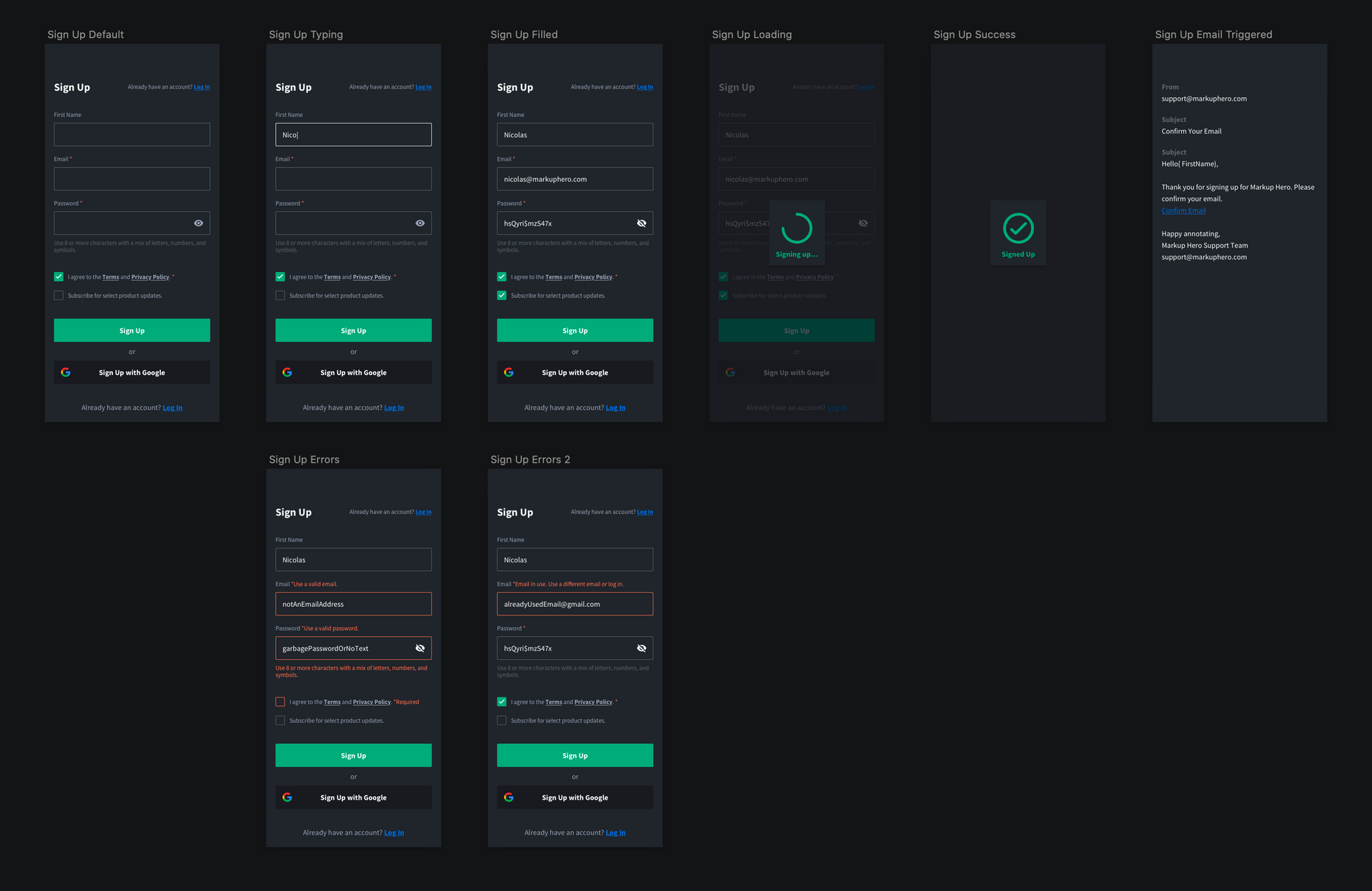
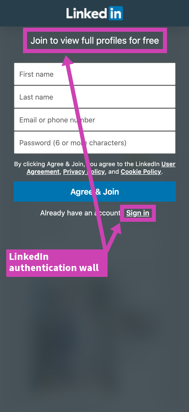
When creating a sign up flow for your app or website you want to consider what information is necessary to collect. Usually this will be a user's email along with a password. For Markup Hero we decided to ask for our users' first name as well for two reasons: 1.) So we could show who a markup was by without exposing a user's email. 2. So we could address users by name in our emails to them.
Note: we made the first name field optionalYou will also want to consider if you can leverage social login depending on the services your users use like Google, Facebook, LinkedIn or Twitter. There are a range of benefits including: trust, reduced sign up friction, verified emails, and rich user profiles.
Also make it easy for your users to opt in or out of your email campaigns right away. This will be greatly appreciated by your users and lawyers alike!
More UX Tips:
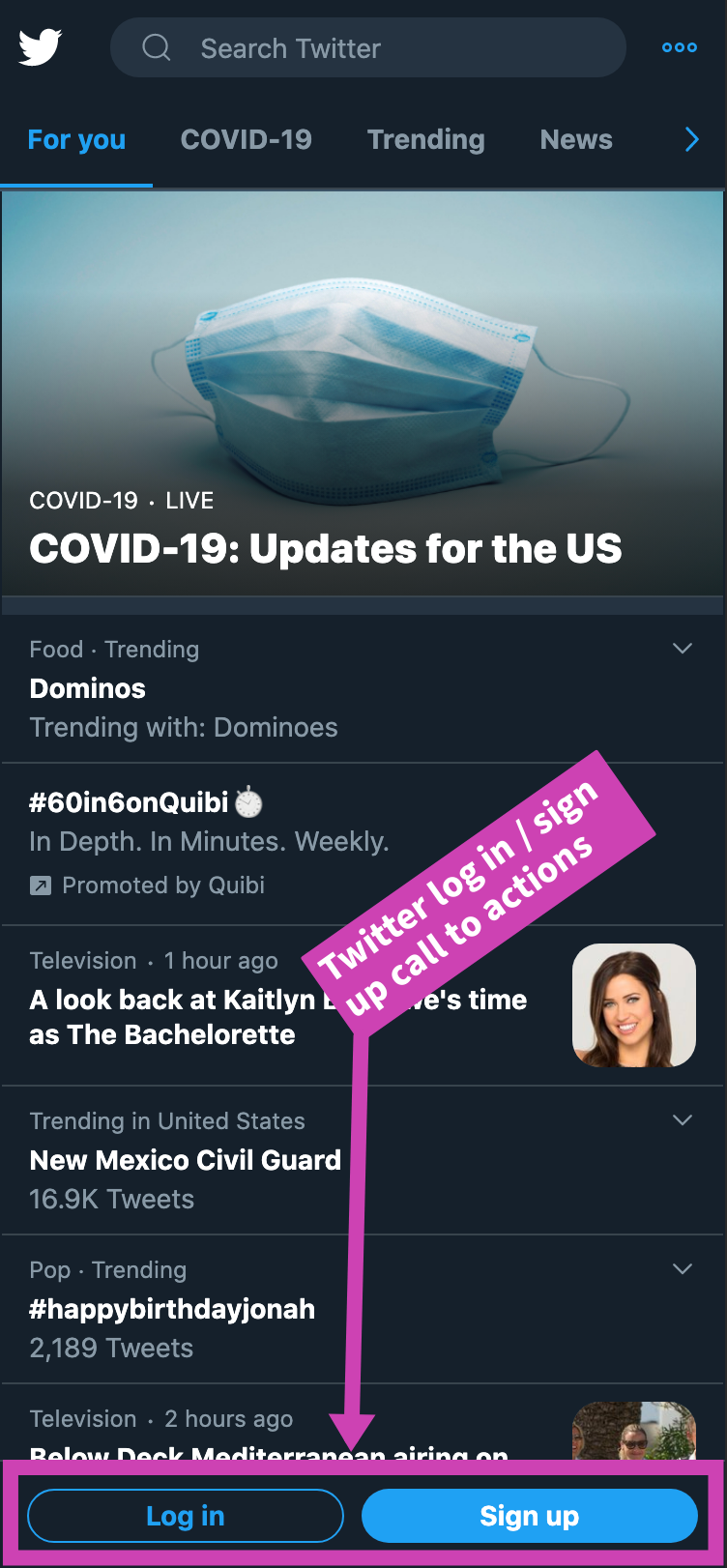
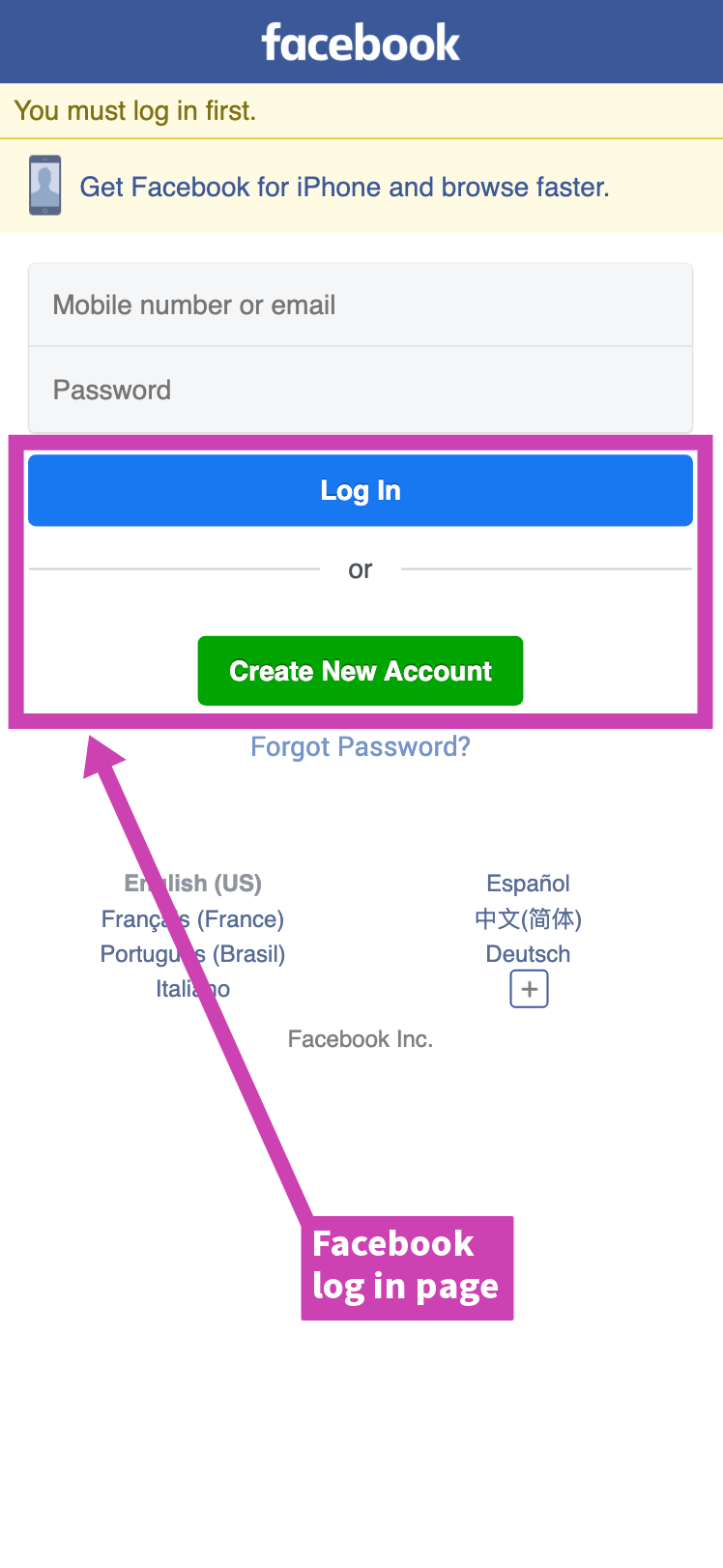
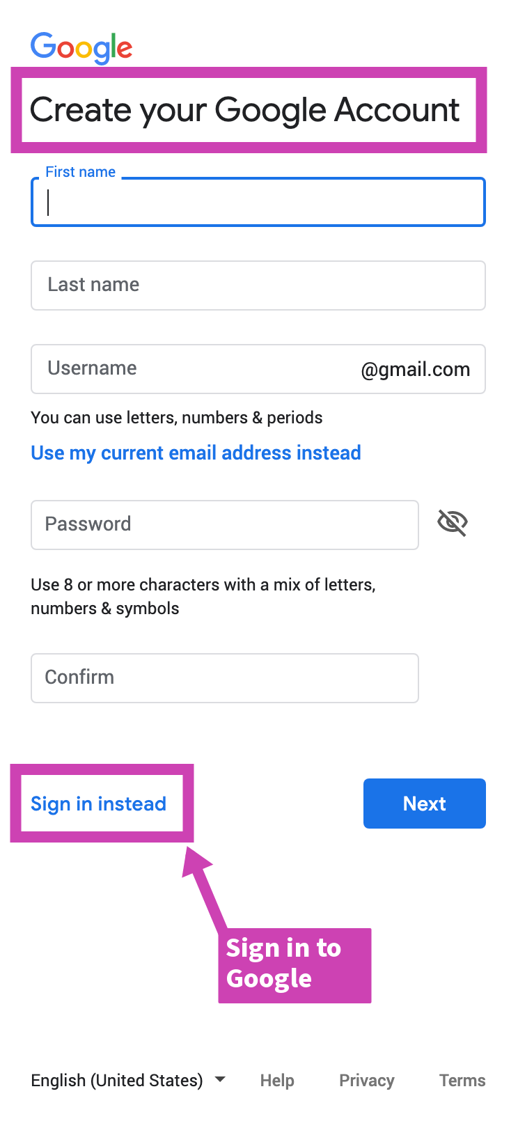
- Use language and design elements to differentiate between signing up and logging in. We used
sign up / log in(Markup Hero & Twitter). Other good combos arecreate new account / log in(Facebook),create account / sign in(Google), orjoin now / sign in(LinkedIn). Notice how we also differentiate the color of the buttons. We use green forsign upand blue forlog in. - Clearly link between your
sign upandlog inpages to help users navigate to the right place. - If you have the space, it's helpful to list some clear benefits for the user on the
sign uppage. This is more common on desktop than mobile, but a good practice regardless.
🔑 Log In Flow & Design
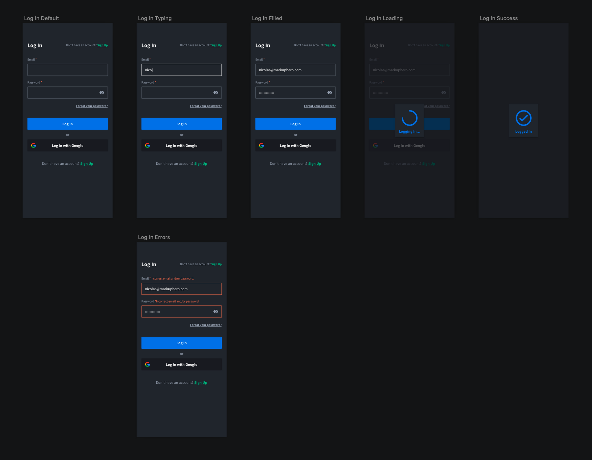
Log in flows are generally a little more straight forward for a simple app or website and require an email and password to authenticate users. Depending on how you are doing you are doing your authentication you might want change your error notifications. For example, it's simpler and potentially more secure to just notify the user that they used an incorrect email and/or password versus splitting up the notifications. In the example above we do not go over two-factor authentication as that generally isn't necessary for simple apps and website.

More UX Tips:
- Allow users to toggle their password as viewable.
- Use at least a 16px font size on input fields if you are designing for mobile web. This will keep iOS devices from zooming when users focus (click into) an input field.
- Define your input fields in the html as type
emailandpasswordrespectively so that password managers can easily autofill. - Clearly link to your forgot password page.
🧠 Forgot Password Flow & Design
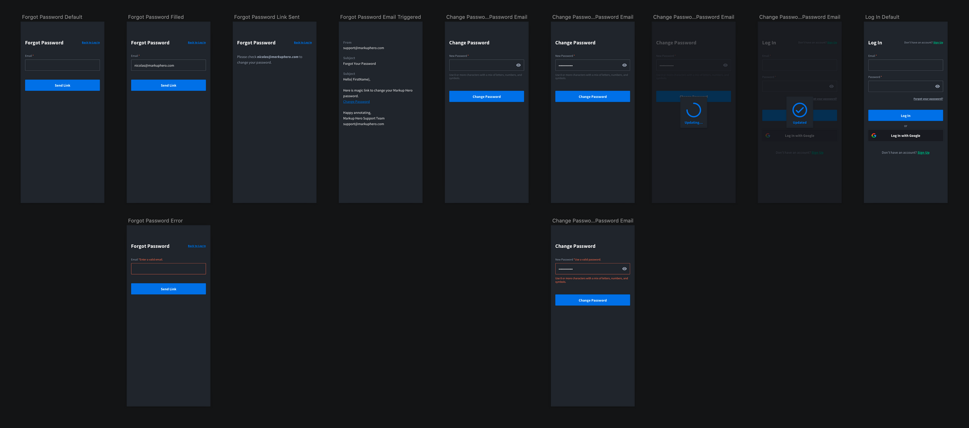
There is more to a forgot password flow than just having a forgot password email input. You'll want to include a confirmation, actual forgot password email, along with a screen to change your password.
Note: At Markup Hero we intentionally chose to keep all our marketing and transactional emails plain text with emojis and gifs. The samples included in these flows are vanilla. There is a lot of opportunity here to express your brand voice in both the copy & the design.
Try Markup Hero
💡 Capture Ideas • 📝 Communicate Clearly • ⏱ Save Time
With Markup Hero you can easily annotate any screenshot, group of images, or even a multipage PDF. No account is required and it’s free.
Try For FreeManage Your Account Flows
In this last section we cover basics of user management flows and designs for:
- Changing your name
- Changing your email
- Changing your password
- Deleting your account
🤖 Change Account Name Flow & Design
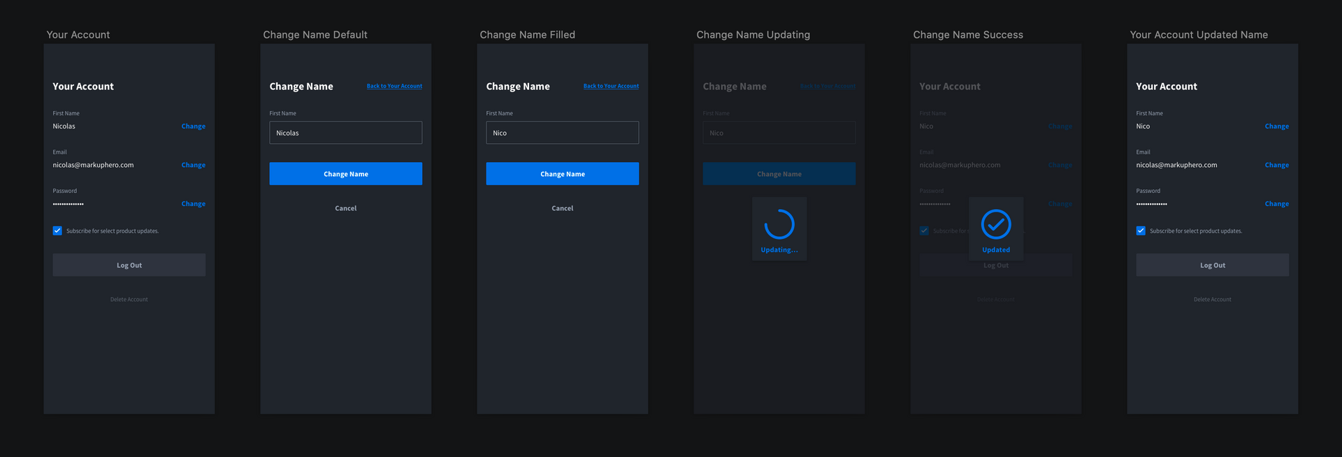
Within Markup Hero we only ask for a users first name. Depending your use cases this might be a full name or separate first and last name. Since in our case it isn't required the flow should be mostly linear.
📧 Change Account Email Flow & Design
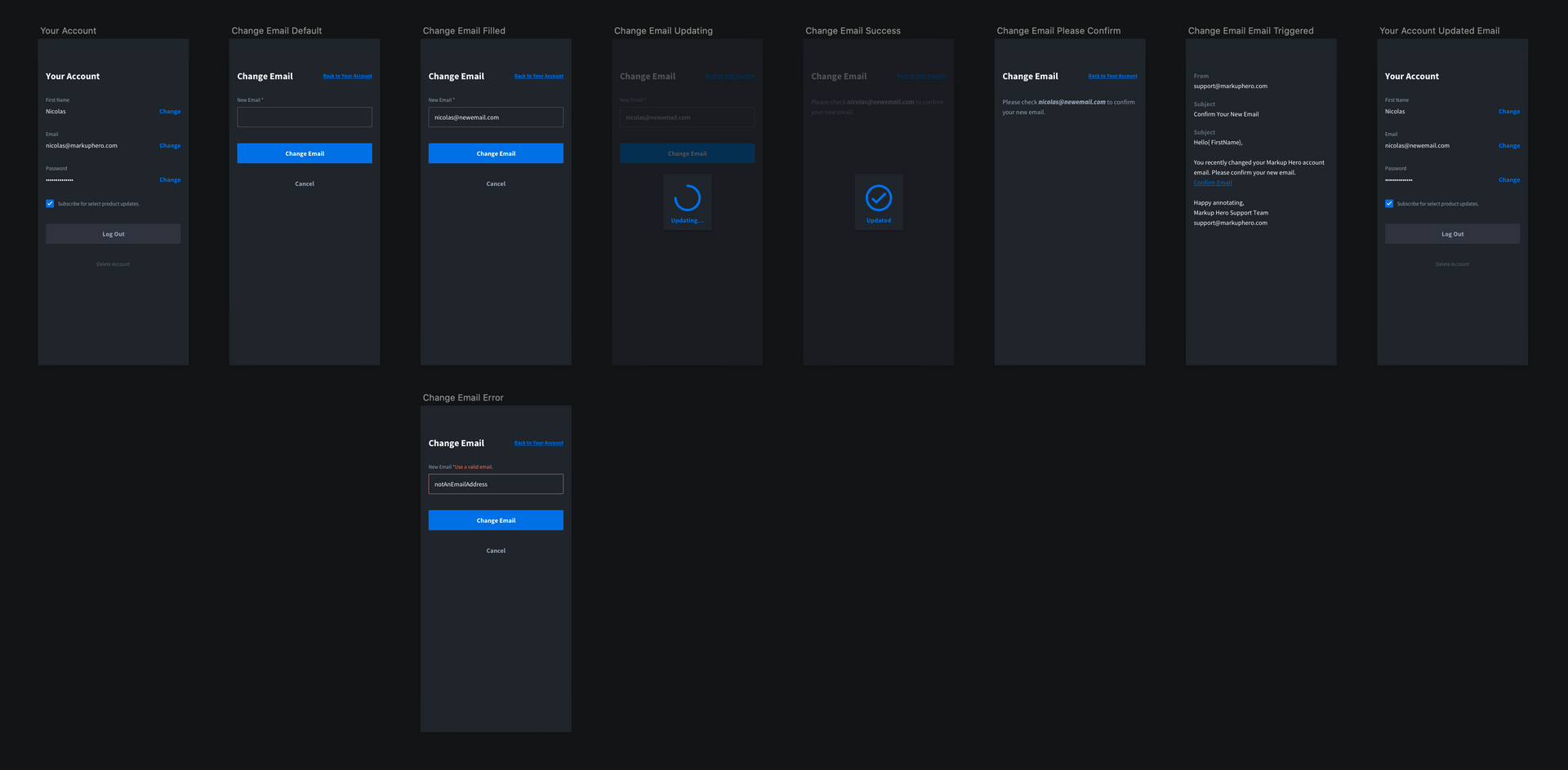
It's important to allow your users to change their email address. When they do so you will probably want to confirm their new email address during the flow.
🔐 Change Account Password Flow & Design
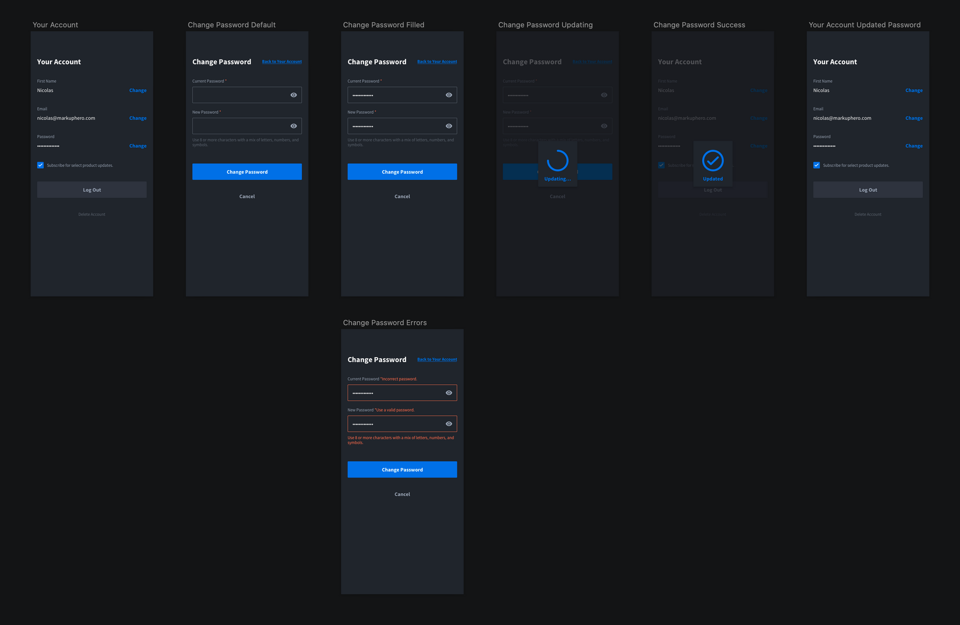
There might be cases were a user wants to change their password. It's important you include this flow if you aren't strictly using social login.
💔 Delete Account Flow & Design
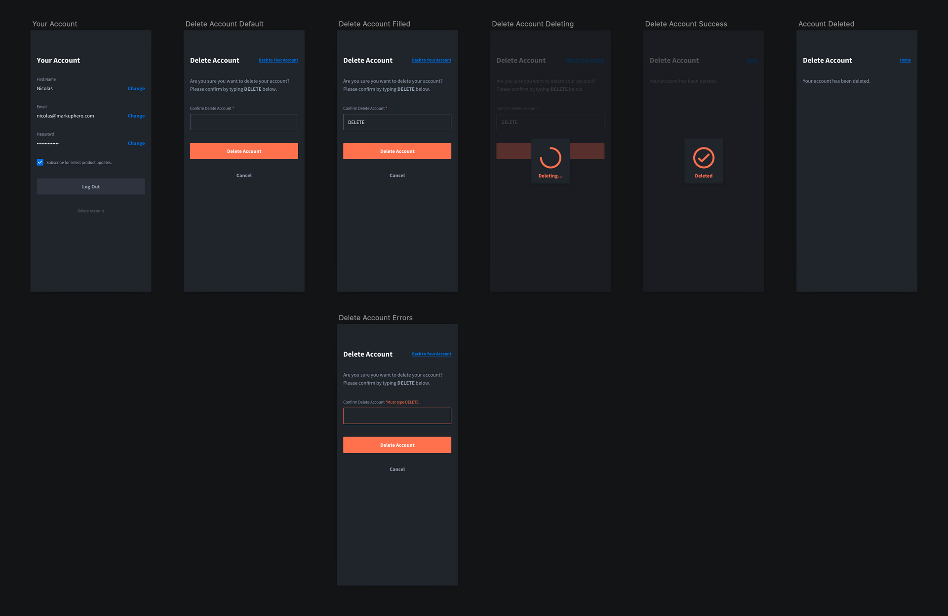
It's sad to see your users go. Allowing your users to delete their account (along with their data) from within your app or website is important as you begin to scale. In the example above you can see we asked users to confirm that they want to delete their account by typing out "DELETE". Alternatively, you can have users contact you directly to remove their account and delete their data.
Conclusion
I hope you found this article and subsequent design files helpful for you next app design or web development project. If you have have any questions feel free to contact me directly here. All the screenshots and annotations in this article were created with Markup Hero, a free new screenshot & image annotation tool I'm building with two friends. If you try it out, let us know what you think!
Link to Sketch design file: https://www.dropbox.com/s/5vyrqntwni09g9t/User-management-by-Markup-Hero.sketch?dl=0
Link to Figma design file: https://www.figma.com/file/oVBFrBBquxr7tjqyNgXSdR/User-management-by-Markup-Hero?node-id=0%3A1


